XL Productivity Appliance: Version 2.15 release
- Workflow
- Nov 26, 2021
- 4 min read
Updated: Dec 14, 2021
We are pleased to announce another feature-packed software update for the XL Productivity Appliance has just been released. v2.15
This release is a big one and focuses on further substantial improvements to customisable dashboards and reporting, along with new 2 week time schedules.
If you find yourself still exporting data to do further reporting in excel or other systems, stop and have a look at how powerful the customisable dashboards and reports are.
Improved Dashboard Layout Tools
In the past, dashboards were limited to three fixed-format sections: One Column, Three Columns, One Column. No longer!
Now, not only can you create dashboards with any number of sections, you can also:
Configure each section with any of eight different column layouts.
Use the new floating toolbar to add a new section, move or delete an existing section, and choose between the eight different column layouts.
Add a collapsible heading to any section to further structure your page.
Drag-and-drop widgets to easily rearrange your dashboard layout.

Top Losses Widget
Another big one. Top Losses is one of the most popular features and now it is available for dashboards as well. That means you can integrate Top Losses into your own custom reports.
Rank and display your Top Losses and choose to show any combination of Lost Time, Occurrences, Loss Percentage, Trend (within the selected time period), and Change (compared to the previous time period).
Top Losses is also now enterprise aware. You can choose to combine work centres and see aggregated loss data for the selected work centres, or you can choose to see losses for individual work centres.

Pivot Table Widget Summarize. Cross-tabulate. Find Patterns
Pivot tables summarize and cross-tabulate data across multiple dimensions, which makes it easier to see patterns in your data. You can think of pivot tables as “pivoting” a dimension from being row-based to being column-based. It’s the same data - just a different presentation.
The key to the unique functionality of pivot tables is being able to specify any of the 19 XL data dimensions as columns. For example, you can show reject reasons, down reasons, or shifts (shown in the image) as columns.
Pivot tables are highly configurable with live controls as shown (from left to right): Enterprise, Time Range, Level, Row, Column, Metric, Filter, Sort, and Export.

Top Losses Attention List Attention lists are a table feature that shows ordered sets of losses as miniature bar charts. Now top losses are available as an attention list. Show up to five top losses per row, where each top loss includes the duration, the type of loss, and the frequency (events, cycles, stops, or pieces).
Top Losses attention lists are great for improvement meetings, as they provide you with an information-rich view of the most impactful losses. Think of it as a menu of improvement options!

Widget-Based Time Ranges Compare multiple time ranges in one dashboard or report
Now, each dashboard widget can either follow the page time range selector or have its very own time range, which is shown immediately under the widget title. This is particularly useful for setting up columns in a dashboard with different time ranges such as: Last Shift vs This Shift or Yesterday vs Today.

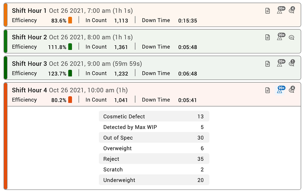
Event List Widget The Event List widget organizes production information in a time-ordered list that is optimized for spotting problems and instantly exploring the underlying data. It’s a great tool for transforming data into action.
Start by selecting a data dimension for analysis, such as shift, part, or hour.
Next scan for problems. Event Lists leverage colour for report scannability and to ensure that problems leap off the page.
Then delve into the data. The three icons on the right of each event enable you to instantly explore:
Metrics (view summary metrics and pinpoint the primary sources of lost production time with detailed Six Big Loss analytics)
Rejects (explore the underlying reasons for poor quality)
Comments (get additional context from comments directly linked to the event or associated with the event time frame)

Improved Dimension Picker The reformatted dimension picker makes it easier to select the dimension you need.
Dimensions are now organized into three groups:
Enterprise: Includes asset-based dimensions like Site and Work Center.
Production: Includes dimensions related to the production process such as Shift, Part and Reject Reason.
Date and Time: Includes dimensions related to time.
We also clarified the distinction between two fundamentally different “types” of time dimensions: continuous time and date parts.
The Time dimension represents continuous time, meaning it shows you time as flowing from the beginning to the end of the time range chosen in the time range selector.
Other Date and Time dimensions represent date parts. Date parts extract part of a date, allowing you to see aggregated time periods for easy comparison. For example, you can choose Day of Week and see aggregated data for all the Mondays, Tuesdays, etc. within the selected time range.

Two-Week Time Schedules Lots of customers have been asking for this one.
XL now supports two-week time schedules, with the ability to choose between 1 Week or 2 Weeks as recurrence patterns.
This enables you to create multi-week schedules such as a version of the “Pitman Shift Schedule,” where four teams split two half-day shifts in a two-week cycle, providing constant coverage on every process.
Also included is a new option for an Empty Schedule that can be used to disable the time schedule feature.


Comments